Matthew Young FIEA Art Blog
Sunday, August 6, 2017
Personal Project 3 Final
Friday, August 4, 2017
Substance Designer Research
Substance Designer
Substance painter has been my biggest attempt to self-teach a program while
at FIEA, as I wasn’t feeling sculpting tileable textures exclusively in Zbrush.
I felt Substance Designer had to be a better way, and after a couple tutorials,
I found that it was indeed a better fit for me. I began learning SD in May
between 2nd and 3rd semester at FIEA and have used it in
two projects. In this post, I’ll be discussing some overarching strategies that
helped me, I’ll be doing a small breakdown of my grass graph to illustrate 2
steps mentioned later and finally I’ll give some quick tips that I picked up
along the way.
Before starting,
the biggest thing to note is that in Substance Designer, nearly everything is
created based on a height map. Creating this height map will take up a large
portion of the total time, and the better job you do of creating this height
map and noting how certain things will be masked based on the different
elements going into your height map, the easier it will be to create your
albedo/base color, your roughness, and your metallic map (if your texture has
metallic variation). Your height will also be directly converted into your
normal map and your normal map into your ambient occlusion.
When approaching a
new tileable texture, just as with any new piece, I break down the large,
medium, and small shapes first. Whether it be rock formations, bricks, dirt, or
something entirely different, there will always be some large set of shapes
that will help you form the overall pattern of your texture. (As a note, it’s
always good practice to increase the tiling being displayed temporarily to see
how recognizable your tiling is. It’s not a bad idea either to actually expert
the textures and test them in engine from time to time either.)
Once you’ve broken your overall texture down into large, medium, and small shapes, determine if there are any obvious layers in the texture. With any sort of asset creation, it’s really helpful to think about how that thing is manufactured or created. Breaking things down into parts and layers really helps with believability and also allows for natural breaks in UV islands and edge flow. How this relates to creating textures in Substance Designer is it allows you to create a robust mask for certain layers that will be used consistently in your graph to divide these layers for compositing later, instead of haphazardly trying to use nodes to detect and isolate features later on. This layering technique may not be necessary for all types of textures, but most of them can utilize this mindset. A recent example for me is when creating a bathroom floor tile material, I created my tile mask which allowed me to develop my tiles and grout independently and bring them together in the end.
Finally, after breaking
down my layers, I begin breaking down each of those into individual parts that
I’ll use to create the layers and larger shapes. In the bathroom floor tile
example, a major part is the individual tile, so I created a square, gave it a
bevel, and blended in a subtle gradient. This single tile will serve as my one
standardized piece that I can now distribute across my whole texture with the
tile sampler node. Another example is creating an individual blade of grass,
which I’ll be showing later on, and using that single blade to create
variations and distribute over the whole screen. One tricky part that gets
easier with practice is learning what detail to include in the individual part
of your texture and what detail to apply over the whole texture once you’ve
distributed your individual parts. An example would be adding edge breakage/chipping
to the tile versus applying a Slope Blur Grayscale node later on to chip the
edges.
Grass Texture Example
This grass texture set was the first SD graph that I really felt
comfortable making. While it’s not complex or fancy, it serves as a good
example to illustrate how to create simple parts that will then be duplicated
to fill the entire texture.
Individual Parts
To create our individual blades, we use a Rigid Bell shape to get our
grass blade shape. Histogram Scan is used to make it a more solid form with
defined edges. We use another Hist Scan to make a more wispy version of the
blade, a levels to reverse it, and a Transform 2d to make it thinner. Then,
with a Blend, we combine them with a Min Darken to form the depressed ridge in
the center. We then blend a Gradient Linear 1 with our blade to give it the
height information it needs to look as though it’s coming up from the ground
below. A Perlin Noise 2 is used with a Directional Warp to make it a bit more
wavy.
Duplicating the Grass
Using 3 Tile Randoms, we achieve different sizes of blades to give some
better variation. The largest blades are run through a Levels to lighten them,
making them appear higher on the Height map. The first two Tile Randoms are
blended together with a Max Lighten to get our full grass height map. It is
then run through a Warp that uses a blurred Clouds 2 node. This adds a bit more
waviness to the overall grass. I also included a third tile random which has
smaller and fewer blades that will serve as the dead pieces of grass. Unlike
the other two, because I want this dead grass to be brown later, I need to
blend it differently. I use a Height Blend, which allows me to blend multiple
nodes toegher but give me a mask output which takes into account how this
texture is blended with the others. Because this dead grass sometimes lays
below the full, living grass, the mask it outputs does not include the occluded
bits of dead grass. This is later run through a Gradient Map in the coloring
phase which allows me to make it brown. The last 3 branches of this node folder
go off to be 2 different masks, with the Levels in the middle going on to be added
on top of the dirt and rocks to create the overall Height Map.
Below are a list of different tips that will hopefully help along the learning
process:
-When blending nodes together, use Copy, Max (Lighten), Min (Darken),
and Multiply as your blend mode when possible. One of the biggest issues I had
starting out was certain values in my height map would get so extreme that they
would begin to clip (pure white or pure black) and I’d constantly have to use a
Levels node to bring it all back to a good range. The nodes listed above don’t
infinitely increase or decrease your values, but keep them in a usable range to
avoid clipping.
-Using the Levels node is a less expensive version of inverting a black
and white texture. Just swap the black and white arrows on the bottom.
INSERT LEVELS PICTURE
-Avoid large, obvious tiling features. Distinct features make fore
distinct patterns. Check your texture at a higher tiling rate frequently to see
if this pattern is obvious.
-When adding detail, keep in mind that subtle details make things
believable, while obvious details make things look fake. Everything should
blend together in a very subtle way, without certain details becoming
overpowering or obvious.
-If you’re making multiple textures sets that will serve as clean,
dirty, damaged, etc. versions to be vertex painted within the same material,
make the most extreme version (dirty and damaged) first and build in a switch
or levels mask that you can easily turn on and off or play with the values on
to get your cleaner versions. The most extreme version can serve as the Master
version that your others are copied from.
-When possible, use nodes like BnW Spots, Perlin noise, or cells to mix
and match with different Warps, Blurs, and Histogram Scans instead of using the
premade Grunge textures. The Grunge textures are premade node graphs themselves
and you can achieve the same or better effect for cheaper if you make it
yourself. The Grunge textures can be very expensive, ranging in the 200+ m/s
range.
Monday, July 24, 2017
Personal Project 3 - Dirty Bathroom Midway Update
Here is my midway update for the dirt bathroom project. I've modeled out the room which I will be using for my bathroom. I've also nearly completed texturing the urinals which will be in the scene. I've textured two different versions which will allow for vertex painting to add variation.
I wanted to get these two parts out of the way so I can spend the better part of this week working on my tileable textures without having to worry about these.Monday, July 10, 2017
Project 3 Proposal
For the third and final project of the semester, I will be creating a run down and dirty bathroom environment with the intent of focusing primarily on tileable texture creation. The scene will be a smaller section of a bathroom and will include several variations of tiled materials, each with texture set variations that can be vertex painted in. The image below is NOT the concept I will be basing my project over, but is to suggest the level of wall/floor filth I'm aiming for.
Sunday, July 9, 2017
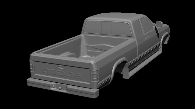
'93 Dodge Dakota Project - Week 4 Final
After 67 hours, my 3D '93 Dodge Dakota is finished. The mesh is 34k tris. I textured it a bit beat up and dirty to fit into my run down gas station scene. I also added the original red pin stripe and lettering because that's how my truck originally looked.
Sunday, June 25, 2017
'93 Dodge Dakota Project - Week 2 Midway Turnin
This marks the midway turn in for our second project. For this project I chose to model my truck, a 1993 Dodge Dakota, which will ultimately be placed into my Gas Station scene from last semester, being that the time period fits. I started the assignment out with the intention of making the high poly entirely in Fusion 360, however 5 hours in I realized that this wouldn't be possible with my time constraints and my current skill level. At the 5th hour, I switched to Maya to start over and made up the lost work within 1.5 hours. This project is currently at the 20 hour mark (15 if you don't include the 5 hours of shenanigans in Fusion.)


Wednesday, June 14, 2017
Project 2 and Research Topic Declaration
Week 1: Begin high poly
Week 2: Finish high poly in Fusion
Week 3: Retopologize and Bake
Week 4: Texture
For my project research, I will be researching and learning more about Substance Designer. I will be incorporating more Designer work in my projects as I progress through this third semester.
Below is an image representing the state of my progress and knowledge thus far.
Subscribe to:
Posts (Atom)


